

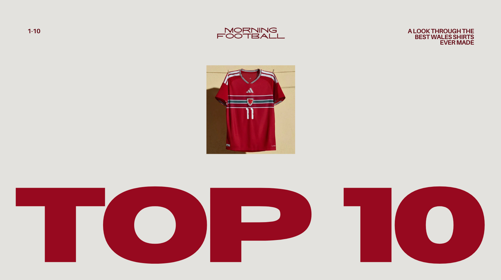
TOP 10:
WALES

With Wales moving on from Adidas in favor of Sudu (why?) I thought it’d be cool to rank my personal top 10 Wales shirts, with some honorable mentions thrown in. Did I think about messing around with a tier list? Yes. Am I glad I scrapped that idea? Also, yes. We’ve had some great shirts in our history, but this is my very opinionated list.
Here they are starting at no. 10.
2026 Home
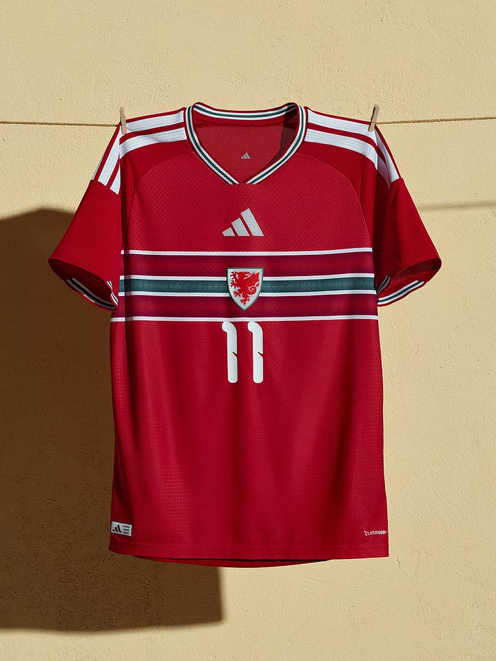

It’s just really nice, isn’t it? I’m a sucker for a center badge, and the subtle ‘Cymru’ on the green stripe adds detail many shirts now lack. Would’ve been great to see it at the World Cup..


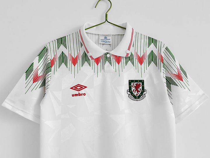
1990 Home
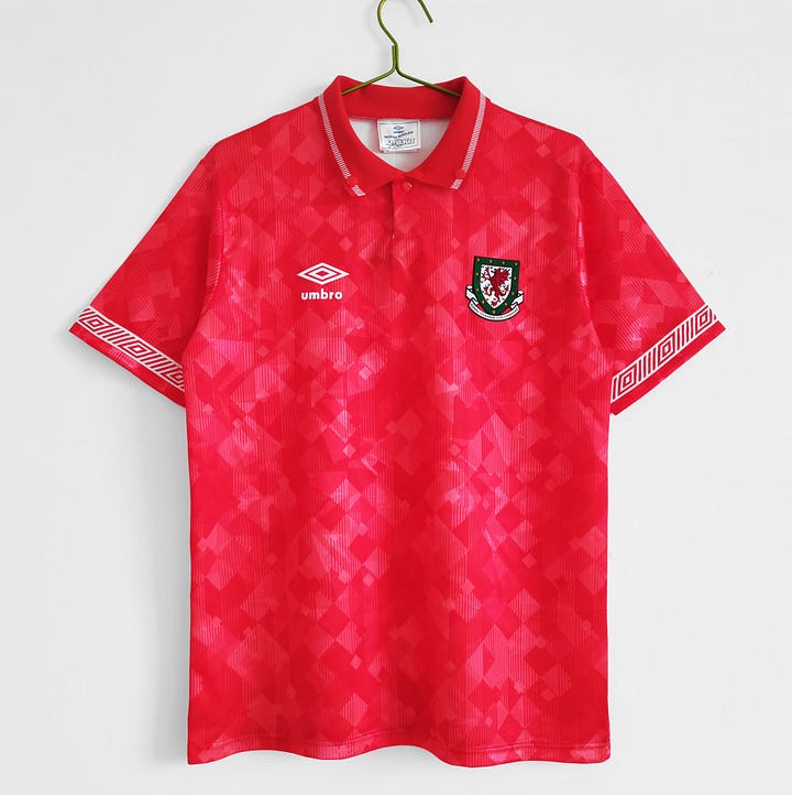
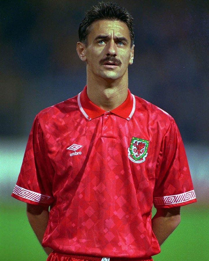
Clean. That’s what this shirt is. I love the pattern, and the collar is always a nice touch. Umbro has been one of my favorite kit manufacturers for a while, and they certainly had it goin’ on in the 90’s. The sleeves have their iconic design, and it looks even better on the pitch under the lights (shoutout Ian Rush).


1984 Away
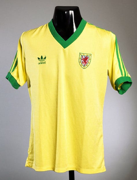
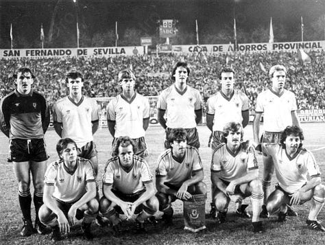
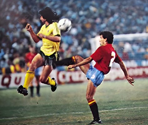
Excuse the black-and-white, but you get the idea. It’s the first yellow kit on our list, but it’s another clean-looking shirt (I’ll probably use that phrase a few more times). The Trefoil Adidas logo is so classic, and the green accents make this a top-tier jersey.


2017 ‘Third Kit’
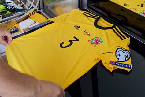

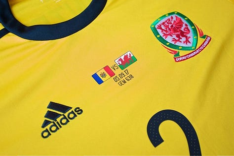
I just like it. The one-off design and colorway were due to a significant kit clash against Moldova in our World Cup qualifying that year. Black and yellow except cooler than the Steelers.
6. 2016 Home

Instant classic. This jersey made it all the way to a European semi-final. I love it, I own it, and it’d be higher on the list if there weren’t some stellar jerseys coming up.


1990 Away
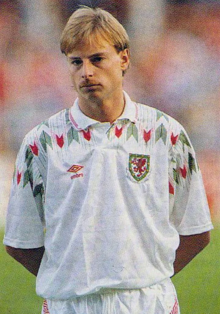
1990 was a great year to be involved with Welsh football, based solely on the jerseys they put out. Another Umbro banger. The pattern and colors contrast with the white, and the subtle ‘metallic’ texture appears on this away kit as well. So clean.


2000 ‘Special Kit’
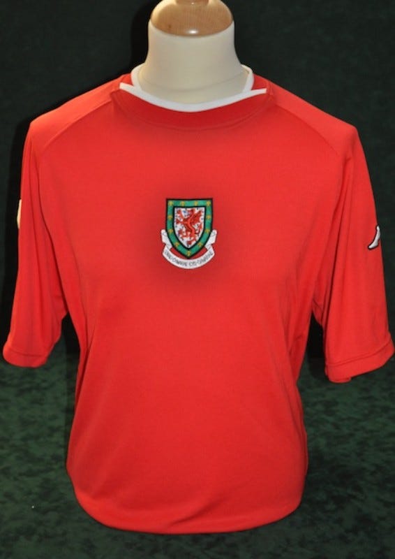
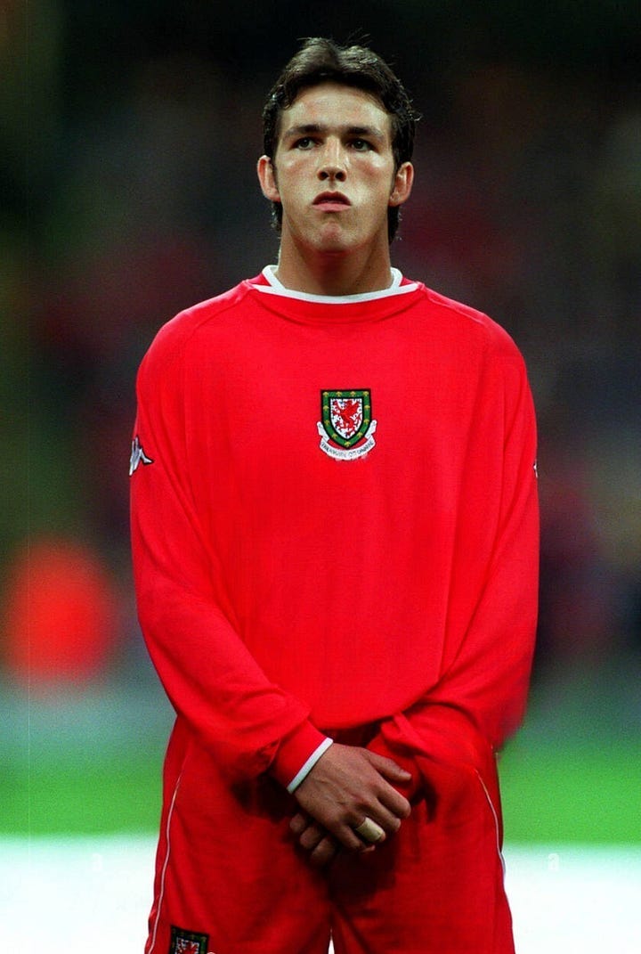
You had me at center badge. Really simple design here with subtle white accents and the Kappa logo on the sleeves. Nice and clean (lol). Kappa brings a sort of streetwear mystique to most of their shirts.


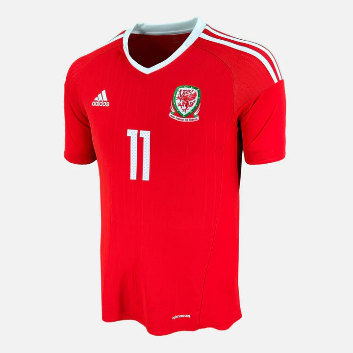
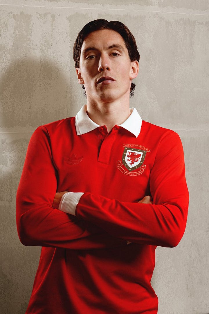
1994 Away
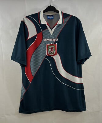
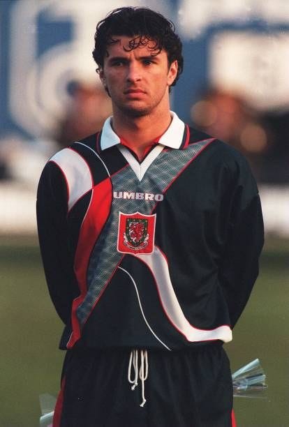
This is another iconic Wales shirt. First time we’ve had blue as a primary color, I believe. The design is cool, and again, it’s an Umbro center badge design. The shielded dragon was an awesome choice, and the red stands out. What’s not to like? (RIP Gary Speed)


2026 Anniversary Kit
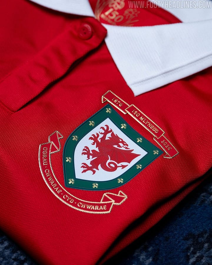
Beautiful. The retro badge with the updated Dragon. It’s the perfect combo, tying in our history and looking towards the future. Simple, clean, and elegant.


2012 Away
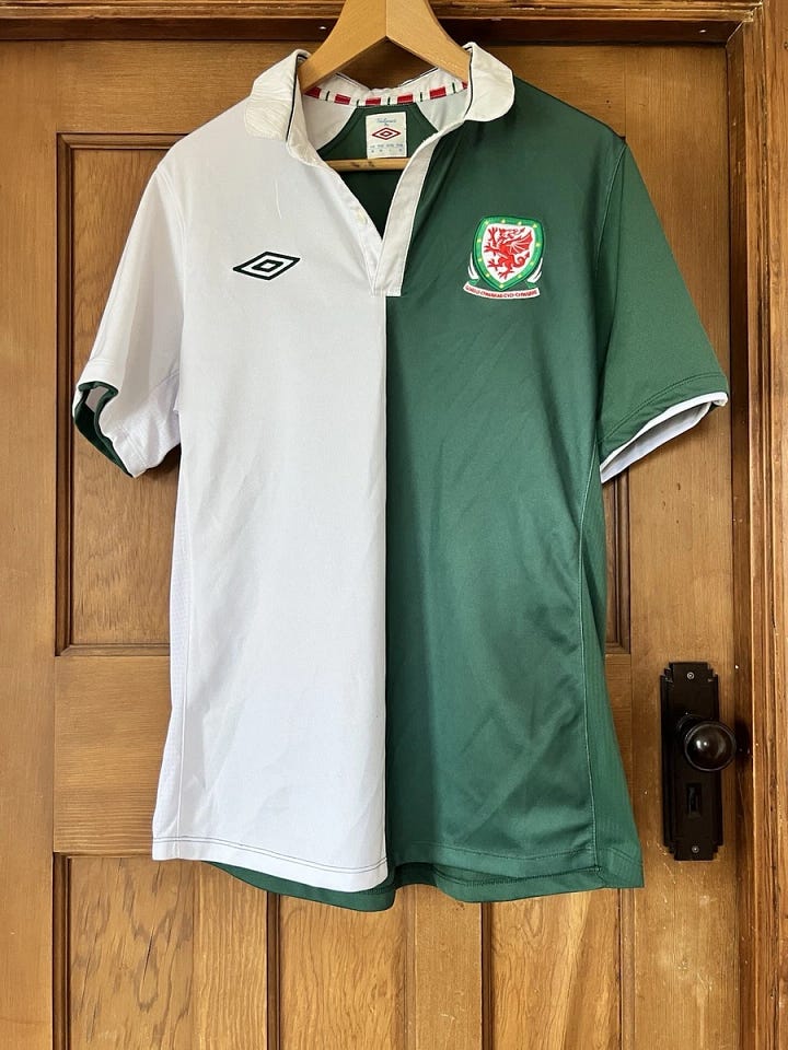
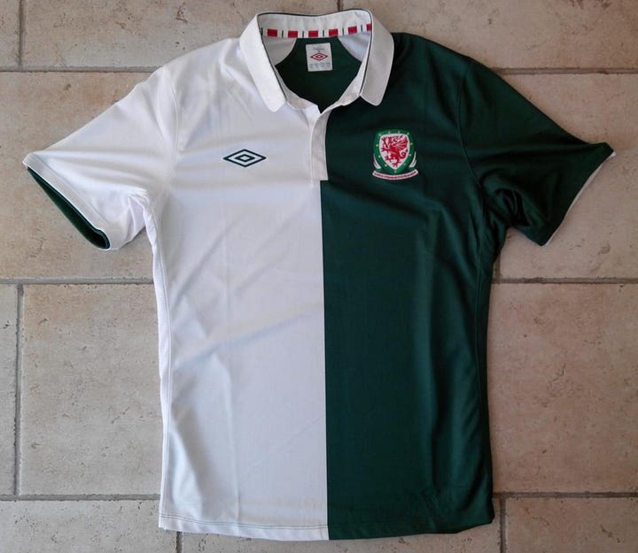
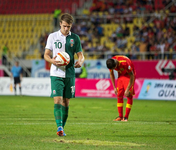
Who guessed this was coming? I swear this might be the nicest jersey ever made. The green and white split the shirt, opening up to an almost full green back. Just a really great-looking kit. There’s a theme here with Umbro, making some of the better Wales jerseys, and I’d love to have them back one day.


That’s it. That’s the list. Some honorable mentions:
1994 GK shirt and the 2018 Home jersey. Both great in their own right (Look ‘em up).
If you take a peek and find there’s a few I missed, or a couple you want re-ordered, let me know! ↓
I want the debate, and stay tuned. Might make this a series.
Suggested reading |

If you’ve been following along and enjoy reading Morning Football you can show some support below.
For inquiries contact:
jon.ebert.10@gmail.com
The Tailored by Umbro range of kits really were a delight. That half and half shirt is a thing of beauty. As a non Welshman, the 2020 home shirt with the deep yellow accents is probably my favourite shirt of recent years.
JONATHANNNNNN this was so fun. Please do more of these. Let’s pretend I didn’t already echo that you should so make this a series in my quote for this 🙂↕️🙂↕️🙂↕️ we need more jersey appreciation ahead of this summer!!!!!!